5 keys to product photography prompts
A good product prompt doesn’t describe the product. It describes the photograph. That single shift is what separates a flat, generic render from an image that looks like it cost five figures and a full day on set. After producing fashion and product imagery with AI at ArtiMindArt, I’ve learned that the model doesn’t need to know what your perfume bottle is for. It needs to know how the light wraps the glass, what the surface beneath it is doing, and which lens a photographer would have reached for. Write like an art director briefing a studio, not like someone filling in an ecommerce form. These are the five keys that move the result the most, in the order I actually use them.
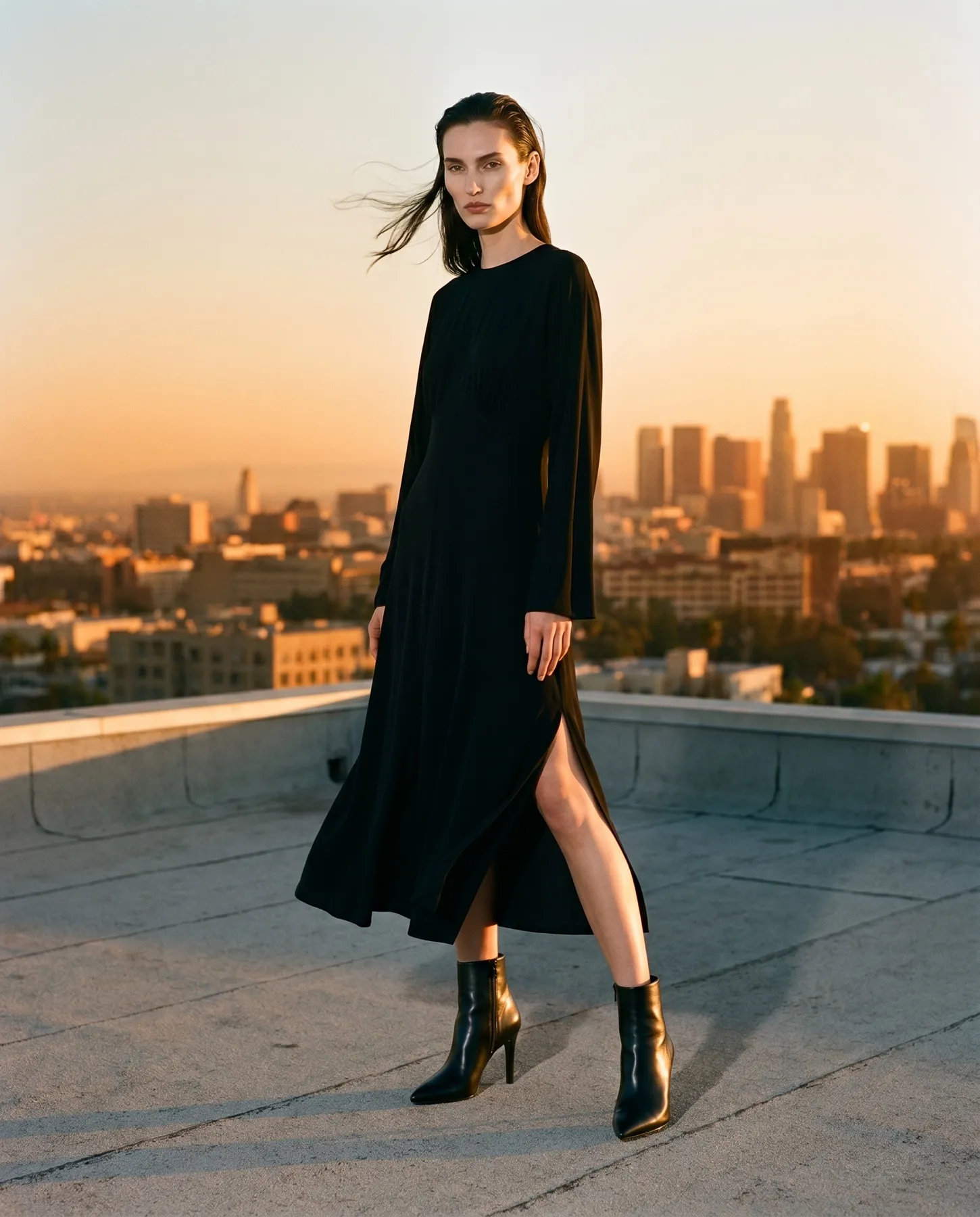
1. Light before the object
Light is roughly 80% of the result, so I describe it first, before the product is even named. Decide the quality and direction: soft and wrapping, hard and directional, side light to carve out texture, top light for a clean catalog look. Then add intent. “Soft diffused light from the upper left, single large softbox, gentle falloff into shadow on the right” gives the model a real lighting setup to build from. Compare that to “well-lit product,” which gives it nothing. For a watch I might ask for a hard rim light to make the steel edge glint; for a skincare jar, soft window light to keep it calm and premium. Set the light and half your job is done.
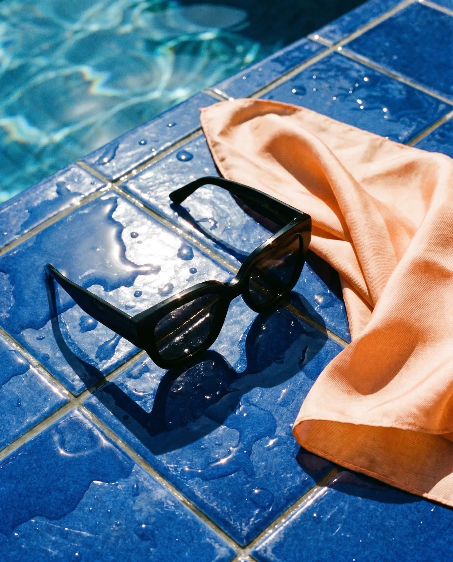
2. Material and finish
The material drives every reflection, highlight and micro-texture in the frame, so name it precisely. “Satin glass,” “brushed aluminum,” “matte soft-touch plastic,” “polished ceramic with subtle craze.” Each one tells the model how light should behave on the surface. Brushed metal scatters highlights into soft streaks; polished metal throws sharp specular hits you have to control. If your product mixes materials, call them out separately: “matte body, glossy cap, anodized ring.” For a leather goods shot I’ll specify “full-grain leather, visible pores, low sheen” so it doesn’t render as plastic. Get the finish wrong and nothing else saves the image.
3. Background and surface
Background is a strategic choice, not decoration. A clean neutral background sells ecommerce: it isolates the product, holds attention, and drops straight onto a product page. A textured surface sells campaign: stone, raw concrete, brushed wood, rippled fabric, water. Decide which game you’re playing before you write a word. “Seamless warm grey backdrop, soft gradient” reads as catalog. “Product resting on wet black slate, faint reflection beneath” reads as editorial. I also specify the surface contact, the reflection or shadow the product casts, because that grounds the object and kills the floating, pasted-in look that betrays a weak prompt.
4. Optics
Specifying optics controls depth and the entire character of the image. “85mm, f/2.8” gives you compression and a soft, shallow background, the classic flattering portrait of a product. “35mm, f/11” keeps everything crisp and slightly wider, better for technical or hero catalog shots where every detail must read. Add the camera move when it matters: low three-quarter angle for power, flat top-down for grids, a tight macro for texture detail. Saying “macro, 100mm, f/8, shallow but sharp on the label” tells the model exactly where to hold focus. Photographers think in lenses, so your prompt should too.
5. Brand reference
Words have limits. Attaching a reference image aligns the result with your identity faster and more reliably than a thousand adjectives. One frame from a previous campaign carries your color palette, your contrast, your mood and your level of polish in a single pass. Use references to lock consistency across a full product line so every shot belongs to the same family. This is also where most teams hit the ceiling on their own, and where, as an official Magnific partner, I push detail, upscaling and finish well past what a raw generation delivers. The reference is the bridge between a good prompt and your actual brand.
Master these five and your prompts stop being guesses and start being briefs. But prompting is only the entrance. Turning these principles into a cohesive, campaign-ready set, with consistent light, true materials and finish at major-production quality, is the work I do every day at ArtiMindArt: fashion and product imagery in days, not weeks, at up to 90% savings. If you want results like this without building the workflow yourself, let’s talk. Send me your product and your reference, and I’ll show you what it can become.